The Psychology of Color in Personal Branding Photography
In the visual feast that is personal branding, colour, or lack thereof, might be the most powerful ingredient of all. For creative entrepreneurs and artistic souls who value authentic connection and emotional depth—colour choices aren’t simply just aesthetic decisions.
If you want the TL/DR notes of this article here you go: colour is powerful and can be used in both bold and subtle ways to communication to your audience before a single word is exchanged. I wanted to write this article not only to help you learn about the power of colour psychology but also to consider how you may use it when planning your next Vancouver personal branding photoshoot, because so often colour gets forgotten about.
Vancouver is full of colour and texture (a personal favourite creative element of mine) , think about the the amazing murals we have all over the city, thank you Vancouver Mural Festival for adding more creativity and colour to our city! Everytime I pass a new one I think ‘oooohhhhhhhh what a great spot for photos!’
Using colour psychology is nothing new, and we can learn about the power of colour through art, film, photography, and all forms of design, and I share examples of in this article. I have embedded YouTube Videos of the artists that I consider masters of colour, and trust me there are more I could add, but this a blog post not a book.
May you enjoy learning about colour and the masters of it!
Fun fact:
My fascination and deeper understanding of colour theory began during my time at Emily Carr University, where I studied graphic design. Colour theory was part of that learning journey and has captivated me ever since, despite not being one to indulge in much colour in my life, I do love it from afar, in art, in film and on others. While my personal style and overall brand aesthetic for my business embraces minimalist black and white with strategic pops of red, hot pink, and yellow (because when I go for colour, I go all in!), I deeply appreciate the full spectrum of how colour communicates with viewers on both conscious and subconscious levels.
Beyond Pretty: how Color Psychology can impact
Your Brand photography
You may be aware, (and if not you’re welcome!) that blue conveys trust and red triggers excitement, but the psychology of colour runs much deeper than these simplified associations, which this blog post aims to help you understand the power of colour and how you can apply it in your own personal brand. When thoughtfully applied to your personal branding photography, color becomes a silent ambassador for your values, your approach, and your vibe. Colour has been masterfully used as a communication tool in visual arts for generations, so let’s get into it.
Masters of colour, from film, to fine art, to photography
Wes Anderson
The first person that always jumps to my mind when I think of using colour in the most magical way is Wes Anderson, not to mention I am a big fan of his movies. Anderson meticulously crafts his distinctive film palettes, creating entire worlds through precise colour coordination, it’s beyond impressive and I am always so captivated by what he creates and how he so masterfully uses colour to invoke emotion and tell a story.
Anderson is also known for his symmetrical compositions, and in my humble opinion these wouldn’t have nearly the same impact without his signature pastel yet vibrant colour schemes that immediately signal his artistic vision. He’s absolutely brilliant if you ask me!
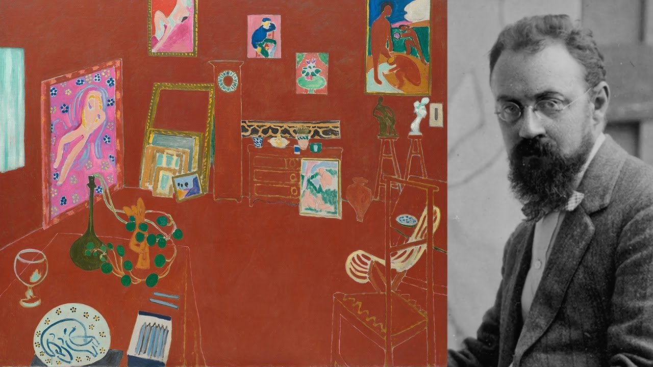
Henri Matisse
Henri Matisse, the French Post-Impressionist and Fauvist pioneer, developed a language of colour that prioritized emotional expression over realistic representation, which is one of the many things I love about this artist. His bold, joyful colour blocks somehow maintain harmony despite their intensity—as seen in works like “The Dance” where vibrant reds, blues, and greens create a sensory experience rather than merely depicting figures. Later in life, when illness confined him to bed, making it hard for him to paint, so he began creating paper cut-outs that have become iconic, with each one using unmodulated colours in simplified forms that expressed complex emotional states while creating a sense of balance and rhythm that continues to influence visual communicators today.
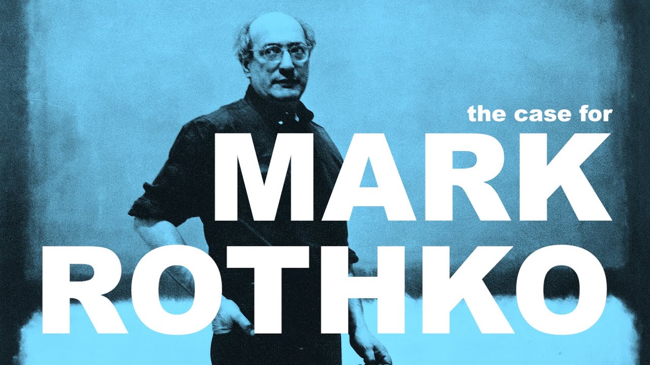
Mark Rothko
When I was in highschool I fell in love with Mark Rothko in the most random, non high brow kinda way… a school poster sale! I remember walking through the gym in my highschool full of books and posters only to be stopped in my tracks when I saw the posters of Rothko, and yes I bought one, a Rothko Pink and Orange art print and how I wish I still had it. I think that was my first art purchase, even though it was just a poster reproduction it opened up my interest in the arts.
Rothko, with his signature rectangular fields of luminous colour, created immersive emotional environments rather than merely visual compositions. The Abstract Expressionist’s large-scale canvases feature soft-edged rectangles of colour that seem to float, pulse, and breathe.
It was a dream of mine to see Rothko’s works in person, and that day finally came when I visited the Tate Modern in London in 2003. This may sound cheesy, but I stood there completely frozen in awe as tears began streaming down my face. It was almost like a spiritual experience—I was overcome with this paradoxical sense of both profound calm and vibrant energy simultaneously.
Rothko wanted to create a transcendent experience through his work, and I can say first hand standing before those massive canvases in the dim lighting of the Rothko Room, I felt something that is coming back to me as I write this, something I find it hard to even put into words. I remember how the rectangles seemed to pulse with life and time seemed to stop as I absorbed the depth of these paintings that simply cannot be captured in photographs or prints.
Rothko’s paintings weren’t objects to merely look at, but experiences to be felt with your entire being— and that is exactly what happened to me when I stood before his work. That moment, standing there in the Rothko Room fundamentally changed how I understand the emotional power of color and modern art, which continues to influence my approach to my own artistry today. Rothko’s art transforms colour from a surface quality to something of a spiritual presence. Rothko sought to evoke what he called “basic human emotions—tragedy, ecstasy, doom.” themes I so closely relate to. His colour fields demand contemplation and physical presence, reminding us that colour can create not just visual impact but entire emotional environments—a powerful lesson for brand photography that aims to connect businesses to their clients on an authentic level.
Ok now onto the next artist cause I could fan girl over Rothko for days…
Georgia O’Keeffe
I am not sure if you knew this or not, but I love to photograph flowers, and recently my dear friend Alicia told me that my photos reminded her of Georgia O’Keeffe, which was the biggest compliment ever!
Georgia O’Keeffe drew viewers into her work through soft, desert-inspired palettes that made her organic forms feel simultaneously intimate and expansive. Her muted yet luminous colour palette—often featuring dusty pinks, pale blues, and earthy ochres—created a meditative quality in works like her New Mexico landscapes and iconic flower paintings. When I look at her work I feel an immediate sense of calm and intrigued, much like how I felt like stood in the Rothko Room, but I am yet to see O’Keeffe’s masterful work in person, it’s on my list to see one day.
O’Keeffe understood how the use of subtle colour allowed her to create depth and dimension while maintaining a dreamy, contemplative atmosphere. Her calming colour choices invite prolonged engagement, demonstrating how muted colours can be just as powerful as bold ones. I also appreciate how O’Keeffe challenged gender norms through her work. Her large-scale, intimate depictions of flowers were revolutionary in their time, reclaiming feminine imagery with unapologetic boldness, and again using softer palettes yet still having a powerful impact. She rejected the overtly sexual interpretations often imposed on her work by male critics, insisting on her own artistic vision and autonomy—a powerful reminder that visual choices can serve as statements of identity and agency.
Here’s a fun fact that many folks are not aware of, O’Keeffe was also an accomplished photographer who worked primarily in black and white.
Her photographic work reveals her keen understanding of composition, light, and form without the element of colour—proving her mastery of visual fundamentals. This duality in her artistic practice—moving between the subtle colour relationships in her paintings and the stark contrasts of her black and white photography—demonstrates how versatile visual communicators can work effectively across the full spectrum from vibrant colour to monochrome.
Photography Masters and colour
William Eggleston
William Eggleston revolutionized colour photography in the 1970s when the medium was still dismissed by the art establishment as commercial and unserious. It’s true that the art world really rejected photography as an art form, maybe another reason my rebel heart has sunk so deeply in love with photography. In 1976 Eggleston had an exhibition at New York’s Museum of Modern Art—the institution’s first solo show of colour photography—which at first shocked critics, and then came to transform how we view colour in fine art photography.
Eggleston’s genius lay in his ability to find extraordinary beauty in ordinary everyday life in the United States: a child’s tricycle captured from below against a suburban sky, a bare light bulb against a blood-red ceiling, or supermarket carts lined up in the Mississippi sun. I know it can be hard to see the power in images of mundane objects and daily life, but that is also where the beauty lies, as we so often take things for granted.
Eggleston’s work reminds us that creating a narrative around your brand story is what he called a “democratic” approach to subject matter, where nothing was too mundane to be worthy of attention, which I absolutely love as we so often take the mundane for granted yet these elements of life are often iconic and carry deep meaning. His photographs demonstrate how a consistent, distinctive colour sensibility can transform everyday scenes into memorable visual statements with emotional resonance.
I often find myself telling my clients that you don’t need all these props and trendy elements to fill your photos with, instead consider what is already part of your daily life, what can your clients expect to see, what is in your community and surroundings that inspire you that others might otherwise walk right past? Look for those things and consider how they not only humanize working with you but also connect you to a time and place without being locked into a fad.
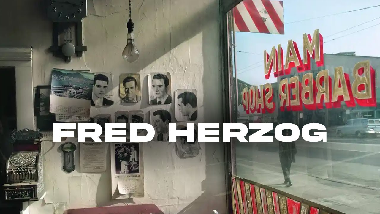
Fred Herzog
Fred Herzog—a Vancouver-based photographer with a remarkable eye for urban vitality—chronicled the city from the 1950s through the 1980s with a distinctive colour palette that has become synonymous with Vancouver’s mid-century identity. Herzog’s preference for Kodachrome film—with its rich reds, deep blues, and vibrant yellows—created a distinctive rendering of Vancouver’s often grey and rainy atmosphere, finding colour and life where others might see only dreariness. For Vancouver residents, Herzog’s photographs offer a colour-saturated time capsule of a city that was simultaneously more modest and more vivid than today’s glass metropolis. His work reminds us that powerful visual storytelling often lies in our own neighbourhoods—in the distinctive signage, the quality of light reflecting off wet pavement, and the human dramas unfolding on familiar street corners. Vancouverites seeking inspiration for their own brand photography might consider: what would Fred Herzog see in your corner of the city today?
I vividly remember visiting the Fred Herzog exhibition at the Vancouver Art Gallery—an experience that left a lasting impression on me as both a photographer and a Vancouverite. What immediately caught my attention was Herzog’s masterful use of the color red throughout his work. As one of my favorite colors, I was drawn to how it appeared repeatedly as a vibrant focal point against Vancouver’s often muted urban landscape.
What struck me most was how Herzog captured red in its various states around the city—sometimes weathered and subdued on old signage or buildings, other times brilliantly fresh on newly painted surfaces. The rich, distinctive tones of his Kodachrome film rendered these reds with a depth and character that’s increasingly rare in our digital age.
Herzog’s exhibition reminded me of something crucial that we often forget in our pixel-perfect world: the profound importance of not just taking photographs but printing them. There’s a tangible magic in film photography that creates a different relationship with color—one that’s harder to achieve with digital manipulation. His work stands as a testament to the value of physical prints, which preserve not just images but the authentic feeling of a moment in time through their distinctive color rendition.
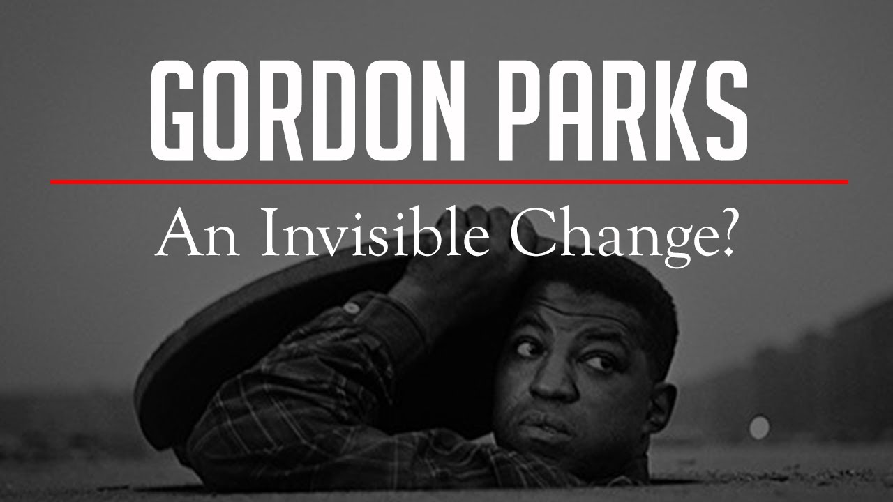
Gordon Parks
I first learned about Gordon Parks in a photography class I was taking on street photography, as I was initially drawn to photography for my love of street and documentary photography. Gordon Parks, a groundbreaking African American photographer, filmmaker, and writer, wielded colour as a profound storytelling tool throughout his multifaceted career.
His 1956 photo essay “Segregation Story” for Life magazine used vibrant colour photography at a time when serious photojournalism was predominantly black and white—a deliberate choice that brought the reality of segregation into American living rooms with startling immediacy. Parks understood that colour could convey both beauty and truth simultaneously: in his images, richly saturated hues highlight the dignity and resilience of his subjects while also documenting harsh social realities.
What made Parks extraordinary was his ability to move fluidly between different worlds while maintaining his distinctive visual voice, which is beyond amazing to me as in our modern time we often feel forced to have to pick a lane to stick too, and he did not and he was able to leave his mark in every lane he choose to explore. The same masterful understanding of colour that allowed him to document poverty and racial inequality with empathy also enabled him to create sophisticated fashion photography for Vogue. In both contexts, Parks used colour intentionally—whether capturing the vibrant clothes of children against the backdrop of segregation or orchestrating elegant colour harmonies in studio fashion shoots. This versatility across contexts demonstrated his profound understanding that colour is never neutral; it always carries cultural significance and emotional weight.
Parks was equally fluent in black and white photography, choosing each medium deliberately based on the emotional and social impact he sought to achieve. In his iconic portrait “American Gothic, Washington, D.C.,” the stark black and white format creates an uncompromising statement about racial inequality, while his colour work often found humanity and warmth even in challenging circumstances. Parks demonstrated that true visual communicators understand when to embrace colour, when to strip it away for maximum impact, and how to adapt their colour approach to different contexts while maintaining authentic vision—a lesson invaluable for brand photographers seeking to make intentional, meaningful choices across diverse projects.
And here is a fun fact about Gordon Parks, he was self taught and bought his first camera in a pawn shop – so please don’t think you need a fancy camera or fancy arts degree to be a photographer, what you need is curiosity, compassion and intention.
Lorna Simpson
Lorna Simpson’s conceptual photography transcends simple documentation to create powerful statements about identity, gender, and race. Her early work in black and white displayed a deliberate restraint, while her later pieces incorporate colour with careful precision. Simpson often combines photographic elements with text and mixed media, creating layered visual and textual narratives that challenge viewers to question their assumptions.
Simpson’s strategic use of colour serves not just aesthetic but conceptual purposes, demonstrating how chromatic choices can challenge perspectives and recontextualize meaning. Simpson is someone that I have recently learned about and I am in awe of the work that she created, as I am currently exploring how to create conceptual multi-media art myself, seeing her in person is on my wish list to see one day.
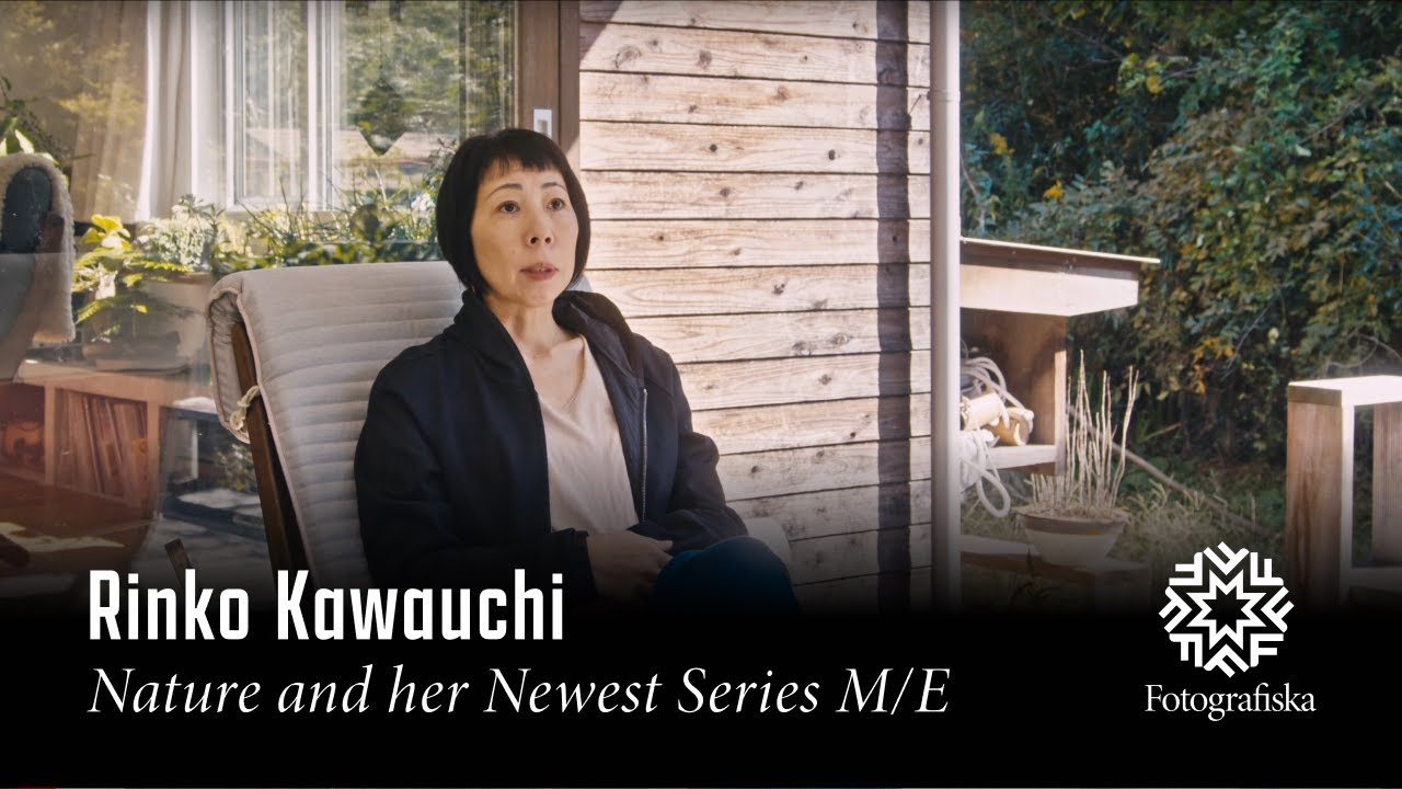
Rinko Kawauchi
Rinko Kawauchi captures ethereal, luminous moments with a delicate colour sensibility that transforms mundane scenes into poetic experiences. When I first came across Rinko’s work I was instantly drawn in, feeling a strong emotional energy that is both calm and a sense of longing.
Kawauchi has consistently uses a delicate, dreamy colour sensibility characterized by soft pastels, milky whites, and diffused light that seems to glow from within her subjects. What sets her work apart is her attention to the subtle colour harmonies in seemingly mundane scenes: the iridescent surface of a soap bubble, condensation on a glass of water, light filtering through translucent curtains, or the tender pink of a baby’s skin.
Kawauchi’s approach to colour is never about bold statement or contrast; instead, it creates a meditative space that invites viewers to notice the quiet beauty in everyday life, which personally resonates so deeply for me which may also be why when I came across her work for the first time I was instantly captivated.
Her work demonstrates how a consistent, delicate colour palette can create a sense of intimacy and contemplation—qualities particularly valuable for brands that seek to establish emotional connection through subtlety rather than boldness. Kawauchi’s colour sensibility reminds us that sometimes the most powerful communications can happen through whispers.
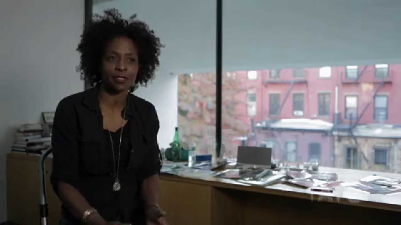
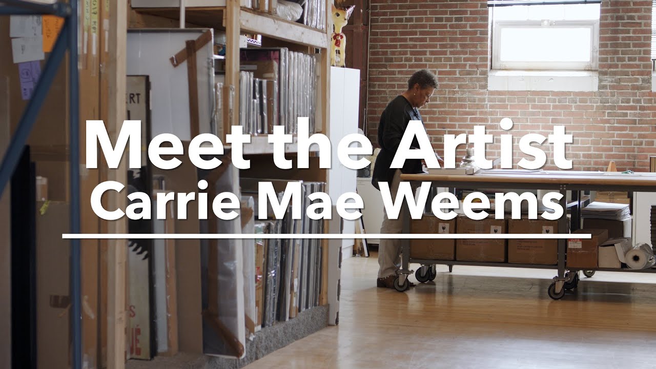
Carrie Mae Weems
Carrie Mae Weems is a multi-media artist who uses photographs, text, fabric, audio, digital images, installation, and video to tell the stories of people whose stories have been silenced or ignored. Carrie Mae Weems uses colour with remarkable intentionality across her body of work.
Weems’ series like “Colored People,” uses tinted photographs that directly confront racial categorization through colour itself, demonstrating how colour choices can function as powerful conceptual tools rather than merely decorative elements.
Weems’ colour mastery extends to her collaborations with iconic figures, such as her striking portraits of Mary J. Blige for W Magazine. In these images, Weems photographed the legendary singer in deeply saturated blues and dramatic lighting, creating a visual atmosphere that perfectly complemented Blige’s emotional depth and musical power. The cobalt blue palette—reminiscent of classic blues album covers while feeling thoroughly contemporary—showed how colour can immediately establish mood and cultural context while honoring a subject’s essence.
Throughout her career, Weems has shown remarkable sensitivity to how colour influences reception and interpretation, making her work particularly instructive for those seeking to communicate complex ideas through visual branding and implementing intentional use of colour.
Colour is more than meets the eye
These masters understood what savvy entrepreneurs now recognize: colour doesn’t just decorate—it communicates, it positions, and it emotionally primes your audience. For the creative entrepreneur who thrives on genuine connection, your colour palette isn’t just about looking good—it’s about creating an immediate emotional resonance with people who are drawn to your unique energy.
The Emotional Language of Colour Palettes
As someone who went to design school, studied colour, created brand identities and continues to create website for folks when I can fit it in, I find it fascinating how much intention goes into one’s brand identity but is often left behind when it comes to telling someone’s story. Perhaps this article will help people see that the intentional use of colour is important beyond your logo and website, and can also be used in powerful ways both on and off screens.
Colour combinations can evoke distinct emotional responses, and that is a fact so start to pay attention as you move through the world, both digitally and in person. Notice what you connect with, and look at the colours, and start to take note of how they make you feel, what are they trying to communicate, do they draw you in or repel you? Understanding these responses within yourself will start you help to see how the use of colour may help you craft your visual identity in a way that will be authentically you.
Now while I am going to share what colours often communicate please note that you get to make up your own palette for your business, and there are no rules here, in fact the best artists often broke the rules, so keep that in mind too.
Warm Palettes: Connection and Energy
Rich reds, golden yellows, and vibrant oranges create a sense of:
- Warmth and approachability
- Creative energy and passion
- Confidence and boldness
- Emotional intensity and excitement
For entrepreneurs who value emotional connection, warm accent colours can signal your enthusiasm and passion while creating an immediate sense of welcome in your imagery.
Cool Palettes: Tranquility and Thoughtfulness
Blues, greens, and soft purples evoke:
- Calm thoughtfulness and reflection
- Professionalism and competence
- Stability and reliability
- Depth and intuition
If your approach involves deep thinking and measured consideration, cool-toned imagery communicates this peaceful, intellectual energy to potential clients.
Neutral Palettes: Sophistication and Timelessness
Blacks, whites, grays, and earthy tones convey:
- Elegance and refinement
- Enduring value rather than trendy approaches
- Sophistication and maturity
- Space for contemplation
For entrepreneurs who appreciate artistic depth, neutral palettes with strategic colour accents can create a gallery-like space where their own creative vision can flourish alongside yours

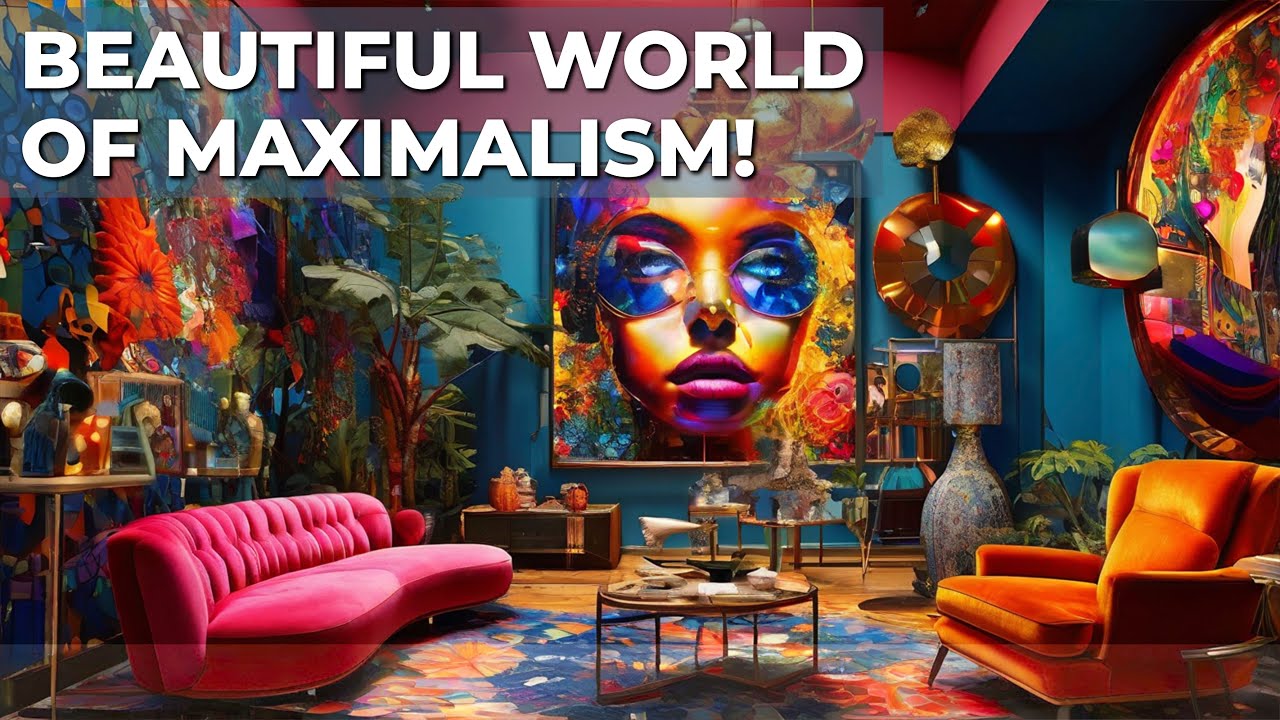
Maximalist Palettes: Bold Expression and Creative Confidence
Maximalism is all about being bold, and combining elements rich in texture, colour and patterns and breaking free from convention.
This approach is created intentionally and is all about embracing that more is indeed more, while also communicating:
- Artistic fearlessness and creative abundance
- Joyful energy and playful spirit
- Willingness to break conventions
- Multifaceted expertise and versatility
Unlike chaotic or randomly chosen colours, a thoughtfully constructed maximalist palette creates harmony through contrast and unexpected juxtapositions. Consider how fashion designer Iris Apfel or filmmaker Pedro Almodóvar use seemingly clashing colours to create signature visual languages that are instantly recognizable yet surprisingly cohesive.
For entrepreneurs who love to break rules boldly this might be an approach for you, offering maximalist colour strategies to create memorable visual impact while signaling creative confidence.
Complementary Palettes: Dynamic Tension and Visual Impact
Colours opposite each other on the colour wheel (blue/orange, purple/yellow, red/green) create:
- Maximum contrast and visual pop
- Dynamic energy and movement
- Balanced yet exciting visual tension
- Eye-catching focal points
Strategic use of complementary colours in personal branding creates opportunity for visual hierarchy—drawing attention exactly where you want it. The tension between opposites creates a visual energy that can communicate innovation and forward-thinking approaches.
When implementing complementary colour schemes, consider allowing one colour to dominate (approximately 80%) while using its complement as a strategic accent (approximately 20%) for maximum sophistication.
Analogous Palettes: Harmonious Flow and Natural Energy
Colours that sit adjacent to each other on the colour wheel (like blue-green-teal or red-orange-yellow) create:
- Natural harmony and organic flow
- Subtle dynamism without jarring contrasts
- Cohesive visual narratives
- Approachable sophistication
Analogous colour schemes mimic the harmonic relationships found in nature—think of ocean scenes with blues and greens, or autumn landscapes with reds, oranges, and yellows. Filmmaker Wong Kar-wai masterfully employs analogous palettes in films like “In the Mood for Love,” using variations of red, burgundy, and amber to create visual cohesion while evoking specific emotional states.
For creative entrepreneurs whose work involves guiding clients through natural processes or transformations, analogous colour palettes in your branding photography can visually reinforce the organic, flowing nature of your approach.

Strategic Colour Application in Personal Branding Photography
How you incorporate colour into your photography matters just as much as which colours you choose. Also an important note to remember here from all of this is that the way you choose to use colour can be bold or subtle, it can come from your surroundings and small elements in the frame. However you use it, the key thing is to use it authentically in a way that you will feel truly represents you. For me that is often a swash of bright lipstick, which I know is not a lot of colour, and I am ok with that. You see, that little splash of red or hot pink illcets my mood at the time, and conveys my confidence unapologetically.
Here are some approaches you may want to consider when thinking about how to work colour into your brand story:
Environmental Colour Cues
The environments you select for your photography contain inherent colour stories:
- Natural settings offer organic, harmonious colour palettes that evoke authenticity and groundedness
- Urban environments provide rich contrasts and unexpected colour juxtapositions that signal creativity and contemporary thinking
- Studio settings allow for precise colour control, with the ability to incorporate exactly the right hues for your brand message
Wardrobe Colour Psychology
Your clothing choices create substantial colour blocks in your photographs:
- High-contrast wardrobe choices (like black and white) create visual impact and authority
- Complementary colour combinations signal creative confidence
- Monochromatic looks convey sophistication and intentionality
- Subtle, earth-toned wardrobes communicate approachability and warmth
Consider how your personal colour choices reflect both your authentic self and the experience clients can expect when working with you.
Post-Processing Colour Strategies
The overall colour treatment of your final images dramatically affects their emotional impact:
- Film-inspired colour grading creates nostalgic warmth and artistic credibility (this is a personal fav of mine!)
- High-contrast processing with rich colours conveys confidence and contemporary energy
- Desaturated palettes with selective colour pops create sophisticated visual hierarchy
- Consistent colour signatures across all images build immediate brand recognition
Finding Your Authentic Colour Palette
The most effective branding colours aren’t simply those that are trending or that you personally enjoy—they’re the ones that authentically represent your brand’s essence while resonating with your ideal clients.
For creative entrepreneurs, consider these questions when developing your brand’s colour strategy:
- What emotions do you want clients to feel when they first encounter your brand?
- What colours naturally appear in your work environment or creative process?
- What colours reflect the transformation you provide for clients?
- Which colours feel authentically aligned with your personal energy and approach?
Beyond Trends: Creating a Timeless Colour Identity
While colour trends come and go (remember millennial pink?), your brand’s core colour identity should have staying power, so choose wisely changing your brand colours is possible but it can be a real pain in the butt to redo a full brand identity so keep that in mind. This doesn’t mean avoiding all trends, but rather incorporating them thoughtfully as accents rather than foundations.
For creative entrepreneurs who understand the value of longevity, consider:
- Building your core palette from colours with psychological staying power
- Using trendy colours as seasonal accents rather than foundational elements
- Selecting shades that photograph consistently across different lighting conditions
- Creating a flexible colour system rather than rigid rules
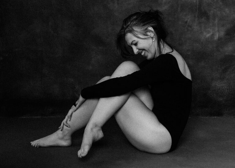
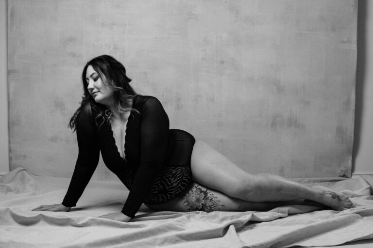
The Black and White Decision: When to Embrace Monochrome
If you don’t know this by know, black and white have my heart, and I wrote another article about why which you can check out here. I know I am biased but I truly believe that sometimes, the most powerful colour choice is the absence of colour altogether. Black and white photography strips away distractions and speaks directly to emotion and form:
- It creates timeless, editorial aesthetics that elevate brand perception
- It focuses attention on expression, composition, and emotional content
- It conveys artistic confidence and sophisticated restraint
- It stands out dramatically in a colour-saturated social media environment
For creative entrepreneurs who value depth and artistic expression, selective use of black and white imagery can create powerful punctuation within your overall visual narrative.
Creating Your Colour Strategy: Practical Steps
Ready to harness the psychology of colour in your next branding photoshoot? Consider these practical approaches:
- Create a mood board of colours that both resonate with you and align with your brand values
- Test different colour combinations by photographing yourself in various wardrobes and environments
- Observe your emotional response to different colours, and ask trusted colleagues or clients for their impressions
- Develop a primary palette (2-3 core colours) and a secondary palette (3-4 accent colours)
- Brief your photographer about your colour strategy before your next branding session
- Ensure consistent colour processing across all final images
Remember, colour isn’t just decoration—it’s communication. When used intentionally in your personal branding photography, it becomes one of your most powerful tools for attracting ideal clients who intuitively respond to your unique visual language.
I’d love to hear how has colour psychology influenced your own brand photography choices, and if this is all new to you do you plan to use colour to communicate your brand message, values and energy?

Thanks for Reading!
Hi, I’m Michele Mateus, award-winning photographer based in Vancouver, BC creating bold, evocative, portraits with an editorial flair for people who want anything but ordinary.
If something here hit the right note, let’s talk!